Side project for helping the LGBTQ+ community stay protected against HIV.
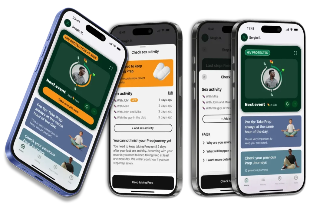
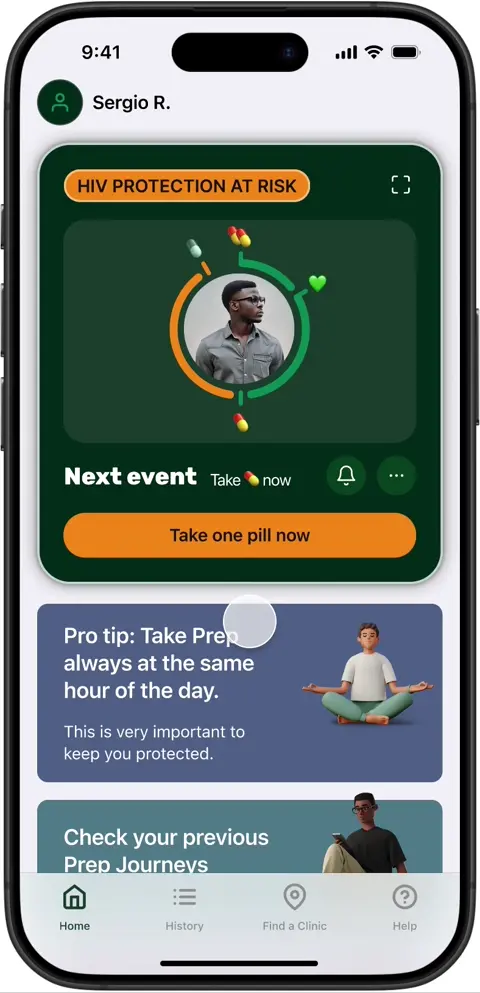
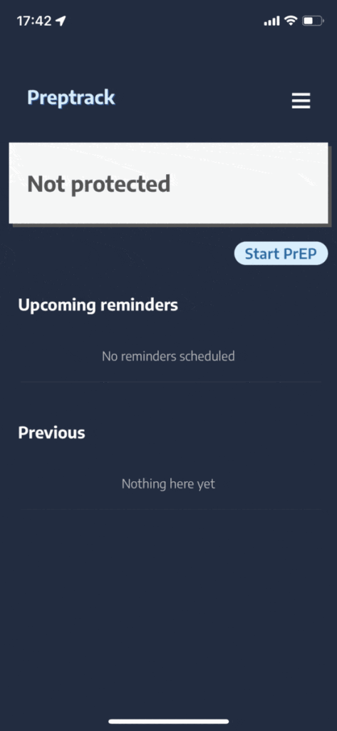
Prep O’clock is an app I designed to support those using Prep On-Demand, ensuring they can take it safely and without hassle. This is a side project I’ve done end-to-end so everything you see is done by me. Prep is a drug that protects against HIV, providing a level of safety comparable to using a condom. It’s widely used within the LGBTQ+ community.
Role
Product Designer
project type
Mobile App
duration
4 months
Skills
Mobile patterns, User Research, iOS UI Kit, Figma Libraries, complex components, Usability testing, WCAG Standards.
Back to the future
I know, I know: ‘Process and research over design’ …but who can resist tasting the cake while it’s still warm? I’ll keep it a secret.
Here’s what you should know to empathise with Prep users!
There are two ways of taking Prep: Daily or On-Demand (when you know you’re going to have sex). In the latter case, you must follow the 2-1-1 Rule to be fully protected: take 2 pills as the first dose, then 1 pill daily until two days after your last sexual activity.
¨OK, let’s continue talking about product design¨
Challenges
Fighting against an ever-changing intake pattern
The number of pills needed depends on the user’s actions (sexual activity), which can sometimes make them feel insecure and fearful. The intake pattern becomes more complicated than the basic 2-1-1 Rule.
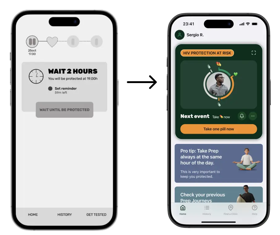
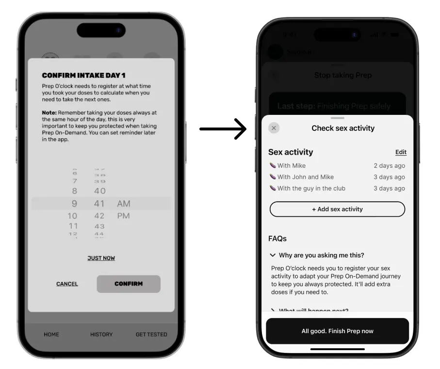
Turn «complexity» into «easy peasy!» ✨
The app must smooth out a journey filled with pain points while always providing a clear picture of the user’s protection.
Goals
Design an app with an On-Demand-first approach
Create the first app focused on Prep On-Demand.
Communicate the 2-1-1 Rule through design
Use design resources to teach the 2-1-1 pattern in a natural and empathetic way, informing users as they use the app.
Secondary Research
To start this project, I conducted indirect research, reviewing medical meta-studies to gain insights into the pain points and challenges of taking Prep On-Demand, as well as a deeper understanding of the field related to the app.
‘Prep: A gateway to improved routine health, but a health risk if taken incorrectly,’ say researchers.
Main findings
Prep enhances sexual self-esteem.
Prep also serves as a gateway to improve routine health and increase sexual healthcare utilisation.
A choice between daily or on-demand Prep regimens could be offered to men who have sex with men and engage in less frequent sexual intercourse. However, the basics of On-Demand Prep work best for men who have sex with men.
Taking Prep incorrectly poses health risks and long-term consequences, such as resistance to HIV medication, so it must be taken correctly.
I conducted research interviews with users to understand the JTBD journey they go through when taking Prep On-Demand and to identify pain points. I interviewed five men who have sex with men and are regular Prep On-Demand users (more than five times in the last year) from two countries where Prep is available through the national healthcare system (the UK and Spain).
‘Did I take the pill already today? 🤔’: The main pain point when taking Prep On-Demand.
Main pain points
Complexity and confusion with dosing schedule: Many users find the PrEP on-demand intake pattern difficult to remember and follow accurately. The variation in doses based on timing and frequency of sexual activity leads to uncertainty, making users feel overwhelmed by the process.
Fear of missing a dose: Users often feel anxious about accidentally missing a dose or mistiming their intake, as they are aware that even a small error could leave them vulnerable to HIV infection. This fear can discourage adherence and impact their peace of mind and sometimes could lead to double dosing.
Lack of accessible and personalised guidance (ever-changing pattern problem): General guidelines exist but users often lack access to personalised reminders or real-time support that fits their specific lifestyle and sexual activity patterns. This makes it challenging for them to feel fully supported in managing their intake accurately.
defining our user
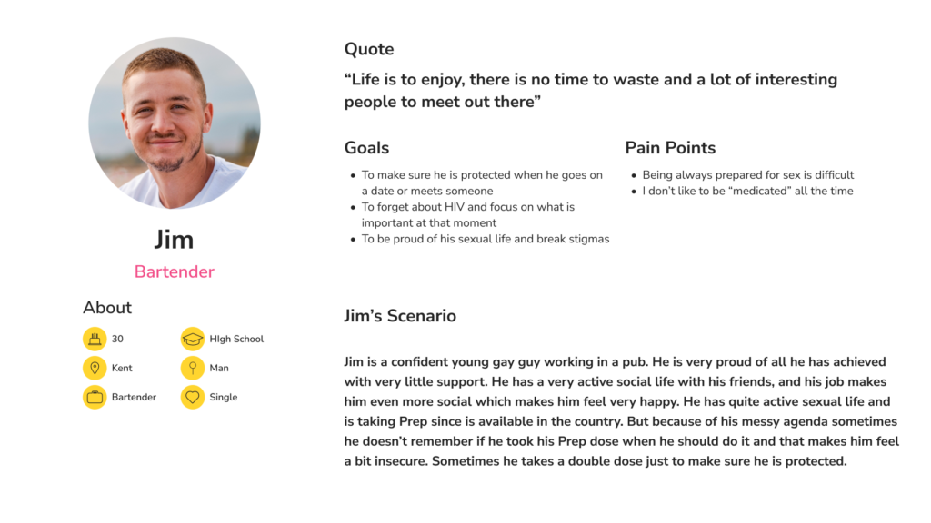
User persona: Jim
User story of Jim
As a young, sexually active gay man who has spontaneous sexual intercourse, I want to take On-Demand Prep correctly, so I can be sure I am fully protected against HIV and focus on enjoying my sexual life.
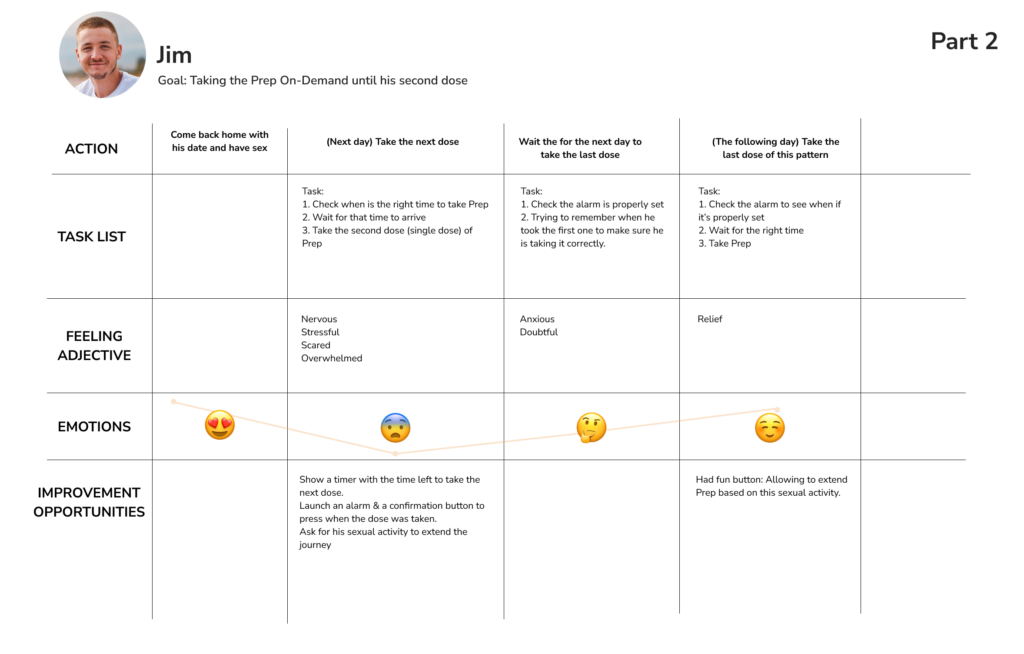
Jim's journey analysis
Problem Statement
Jim is a gay man who needs to take Prep On-Demand correctly because he leads an active sexual life and wants to be protected against HIV, ensuring a happy and healthy sexual life.
Hypothesis Statement
If Jim uses an app to track when and how he takes his Prep, he can be sure he’s taking it correctly, removing any doubts or stress he might have when having sex.
Competitive audit
I conducted a competitive audit before starting to ideate solutions, aiming to identify strengths and weaknesses in other similar apps.
“Why is no one really focusing on Prep On-Demand yet”
Main findings
Lack of visual tracking: PrEP apps don’t clearly show where users are in their on-demand dosing.
Complex designs: Users struggle to quickly interpret app data, requiring too much effort.
Ineffective calendar layout: Calendar designs don’t fit on-demand PrEP, which needs alarm-style reminders.
Unfriendly design: Apps feel rigid and lack an empathetic, user-centered approach.
Tedious setup and big cognitive load: Too many steps to input information before users see any real benefit.
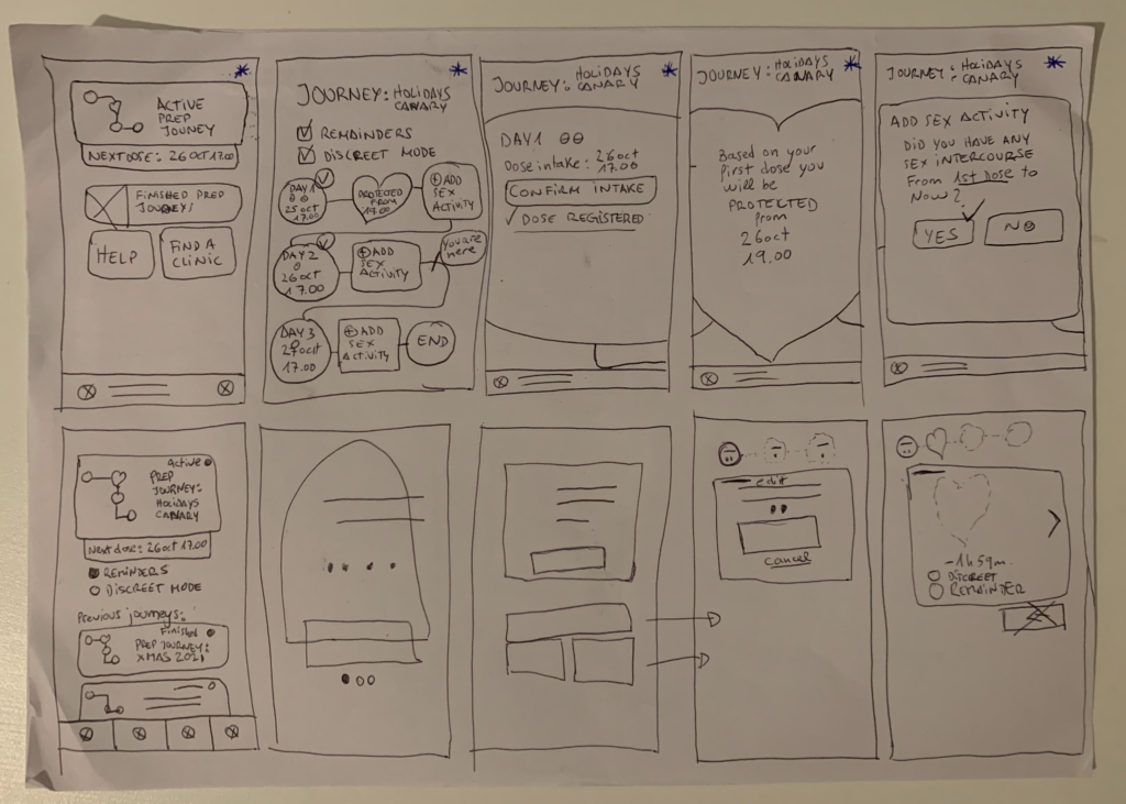
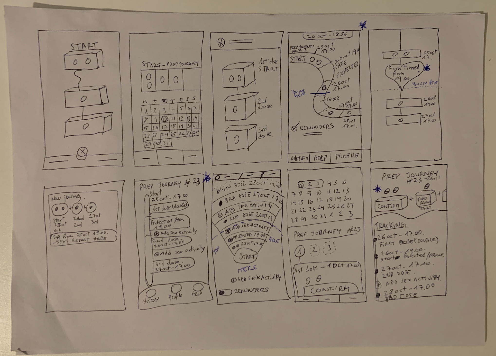
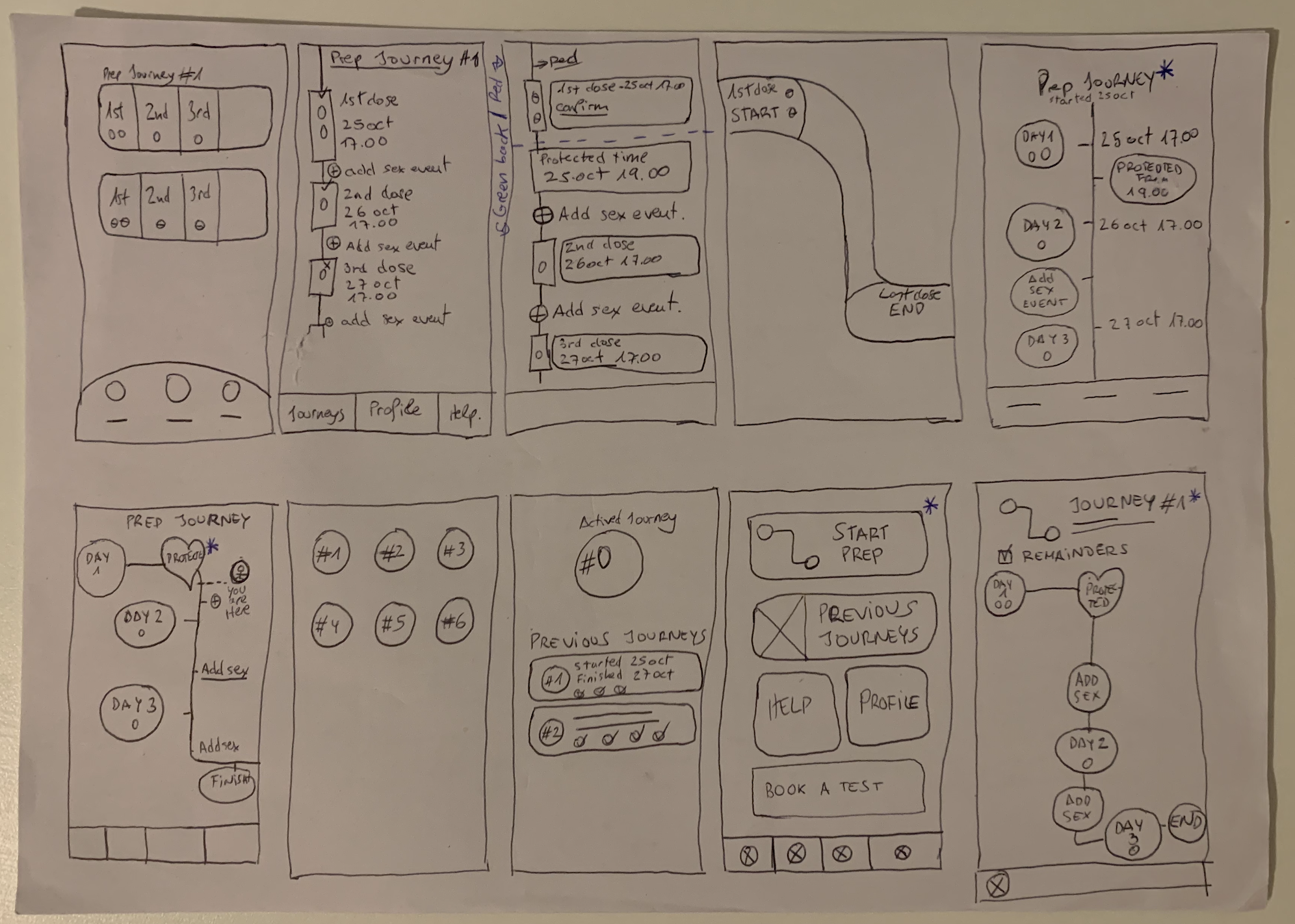
Proof of concepts & lofi prototype
I explored several ways to transform the concept of the On-Demand journey into solutions that could effectively visualise the intake pattern. My goal was to combine a visually appealing solution with a clear representation of the intake process.
The exploration mainly focused on finding a way to visualise the intake pattern
Lo-fi prototype ready for usability testing
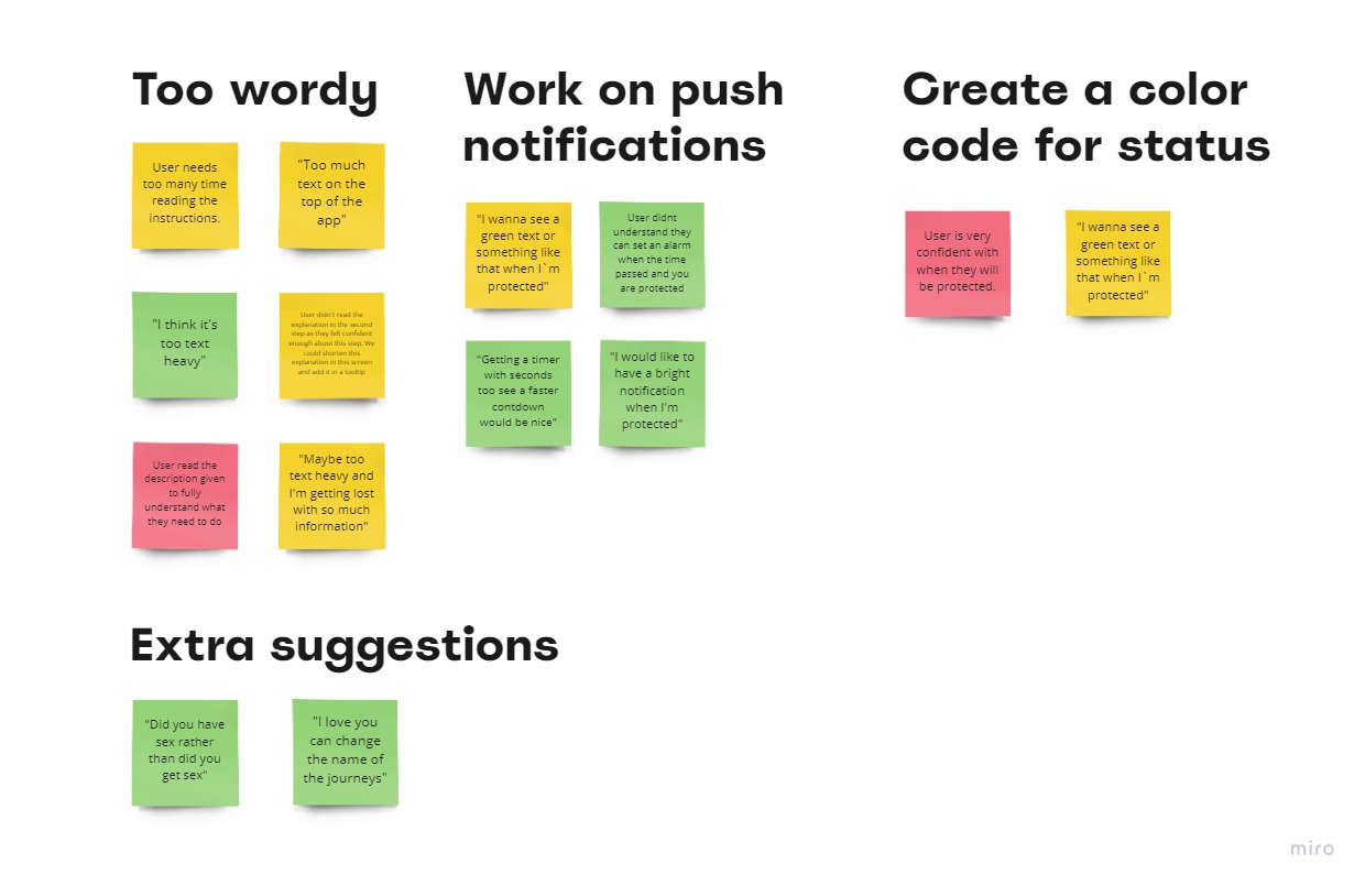
usability testing
Two rounds of usability testingwith 5 participants each time focusing on refining functionality and improving flows.
Research questions
Is the Prep-taking journey easy or difficult to use?
Are any steps missing in this process?
Do users feel supported at every step?
Does this app cover the entire On-Demand Prep journey?
Designing this app brought me a personal and intimate sense of relief. As an On-Demand Prep user, I wasn’t always sure if I was taking it properly, and I personally experienced many of the fears and pain points I uncovered in my research. Creating an app that could potentially address these issues made me realise how valuable I could be to society as a UX designer. This kept me highly motivated throughout the entire journey.
FUTURE WORK
Here are some ideas I couldn’t scope in this iteration, but could be addressed in future rounds:
Design a user profile section to track all your journeys, which can be shared with sexual health clinics.
Integrate with booking systems of sexual health clinics for testing and obtaining Prep.
Incorporate a Daily journey for Daily Prep users.
Drop me a message!
You can email me to sergioriquelmesanchez@gmail.com