Imagine joining a scrappy design team that’s striving to iterate quickly but is failing to empathise with its users, lacking a solid, cohesive system for optimal performance. This was the scene at Quester when I came on board.
The product was simple: A place to create your own collections of recommendations but the system behind it was chaotic.
I started by doing tons of questions:
«Where is your documented product vision?»
«Show me your design system»
«Could you show me the documentation of previous iterations to understand what is the path the product had followed and especially which one didn’t work?»
«Where is your brand book?»
«How do you deal with light and dark mode?»
«Can I have access to previous UX researches?»
«Why do you have so many unorganised pages on Figma?»
«Why there is not a published Library in our Figma account?»
«Who is owning your current ‘design system’?»
«Do you guys have a design system at all?»
¨How, Where, Why, Why, WHY, WHY, WHY!? I found myself facing a black hole of information.¨
The absence of clear guidelines and structure made the design landscape seem chaotic. Designs were inconsistent, and there were notable accessibility issues and lack of an unique source of truth.
Product team had created a very heavy suitecase and they are now trying to carry it around the world. But, you need a light and flexible backpack when you want to reach every corner in the world.
This is what I found when I joined
The catalyst for change
Despite numerous attempts to understand the logic behind the existing system, no one was able to explain how the system they constructed functioned.
Following an extensive discussion with the Head of Product regarding my role within the company as a senior product designer, the value a could deliver with the current system and the evident obstacle posed by it, it became clear that we needed to try something new but also we will need a plan to get the buy-in needed to solve it.
Running a design audit.
Examples of pages in Figma where they used to have the assets and build features. No structure at all. Literally thousands of different unorganised assets across multiple pages.
In order to raise awareness of the rising issues, I led the design team in performing a comprehensive audit of our product, meticulously mapping out every screen, button, icon, component and workflow. Using this audit, I created a visually striking collage that showcased the diverse array of button styles within our product, highlighting the fragmented nature of our current product and the resulting confusion for our users.
I then presented this shocking visualisation at a company-wide «show and tell».
We have 44+ different buttons styles! 🤯
No one could explain how this happened but that sparked insightful conversations and questions such as, «Why do we keep creating new buttons?» and «What is this like for our users?»
How is this impacting the business and to our users?
We were failing to maintain consistency in our designs.
We encountered multiple issues when handing off the designs to the development team.
It was almost impossible to work collaboratively, as only a few people in the company could understand our Figma files.
Our data indicated that we were losing active users and experiencing a decrease in our level of engagement.
Users were constantly sending us feedback about UI problems.
We were not achieving growth in key metrics
¨With no design system or clear product vision and a minimal emphasis on UX, the quester experience started to no longer feel pleasant to our users.¨
At this point, everyone agreed:
Something needs to change
¨OK, guys, this is ‘easy to fix’. We need to build a proper Design System – based on industry standards.¨
Creating a shared brand awareness
Stakeholders first, the whole team following.
I had several meetings with the C-suite to come to an agreement on the most fundamental brand decisions. I requested references, values, and mood boards to fully understand what the brand aims to communicate.
Based on that information, I prepared a preliminary brand book with a proposal for the look and feel of the company, including brand colours, values, tone of voice, language guide, typefaces, and logo applications.
After a few feedback loops, we reached an agreement and presented it to the entire company.
From this point the product team could start to shine. ✨
DEFINE
Our new leitmotiv: Scalable, dynamic & easy to manage.
Scalable
We created an official tokenised Figma library using a secondary Figma library as the primitive and source of truth for the main one. Additionally, we will create a library of components for reuse. These will be built with auto-layout and variants to provide a collection of drag-and-drop components that everyone can use.
Dynamic
We will design only the assets we need and keep the design system as minimal as possible.
Easy to manage
We have promised never to revert to our old mistakes. From now on, we will maintain a unique source of truth, and no one will be able to design anything new that has not been previously approved and properly documented, ensuring it can be reused from day one.
And when everyone work aligned the magic happens 🪄🎩🐇
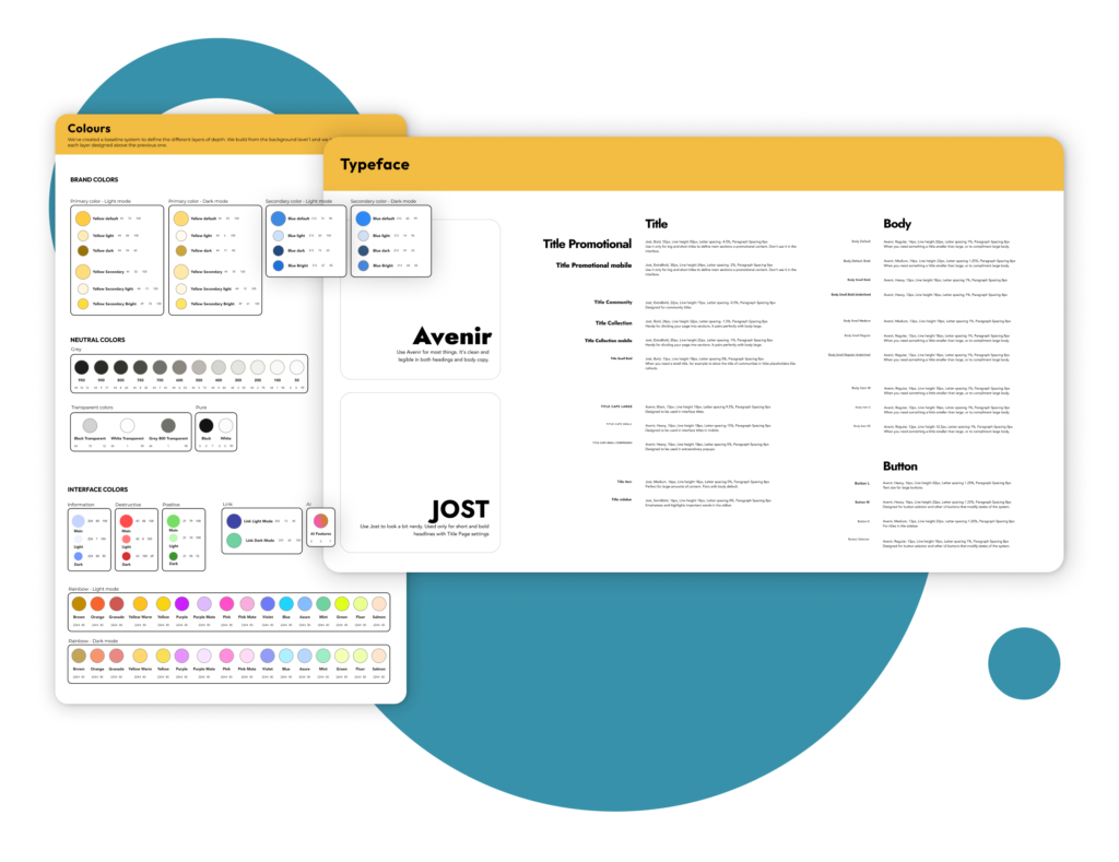
Branded colour palette and new typefaces
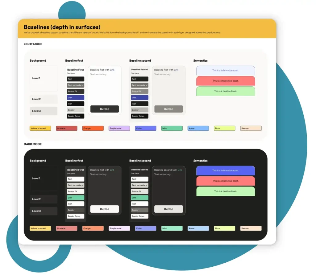
Baselines: Defining the different overlapping layers and colour hierarchy in both Light and Dark mode from the Figma Library.
Only a few powerful buttons to solve our 90% of design needs, each with all the nested variants and in auto-layout.
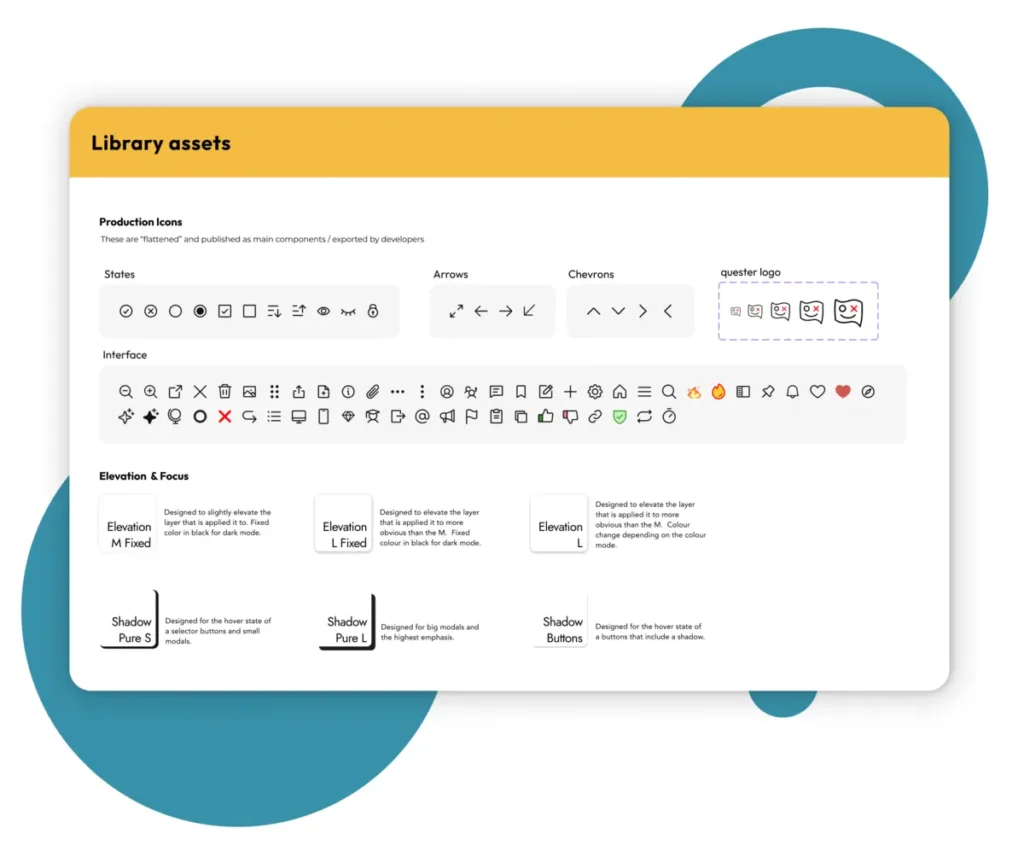
Brand-new icon library, along with elevation and shadows, integrated into our Figma library.
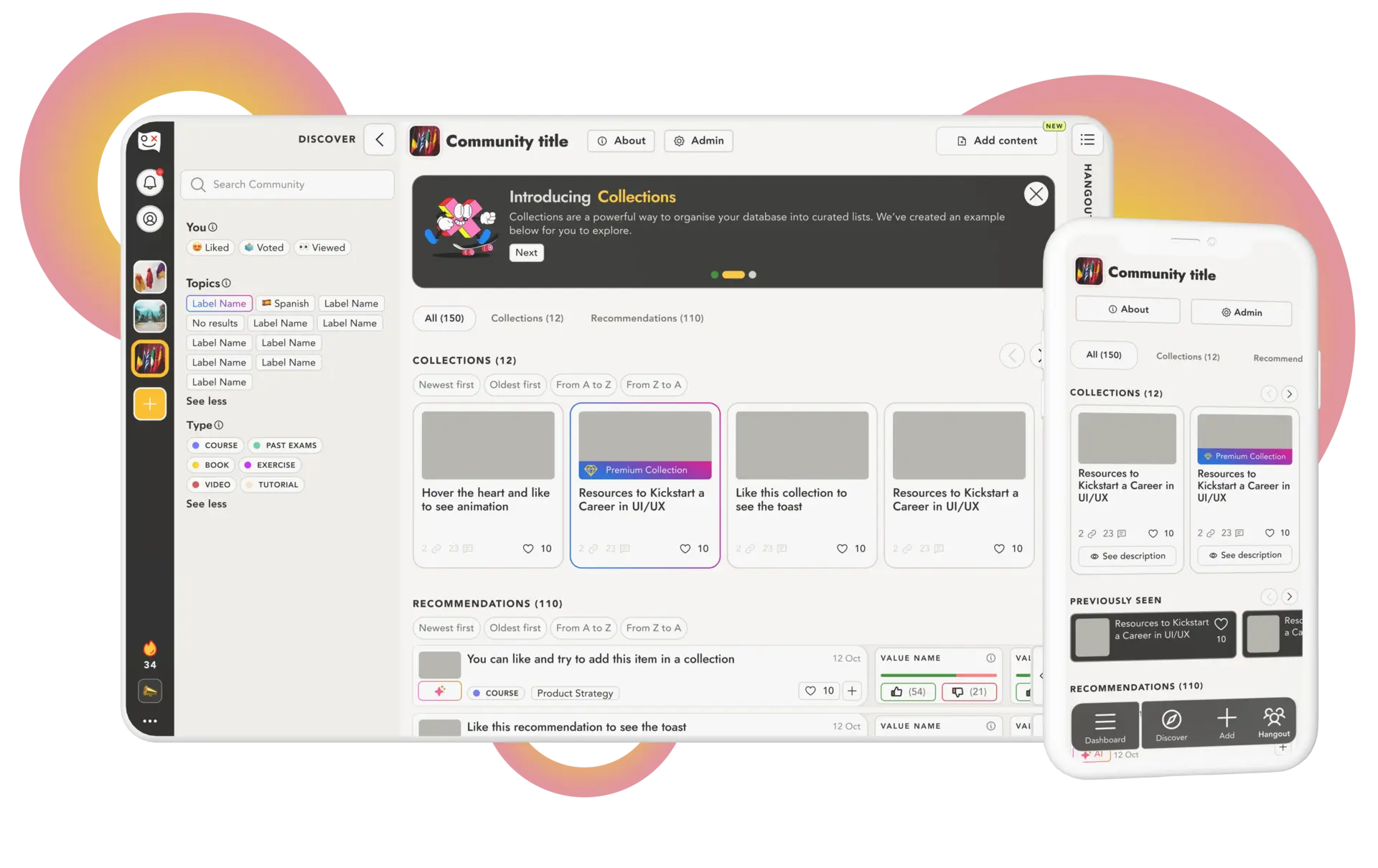
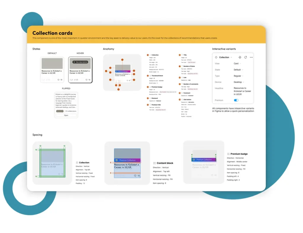
Collection cards, the main way we deliver value to our users.
Recommendation components, our most basic expression of value.
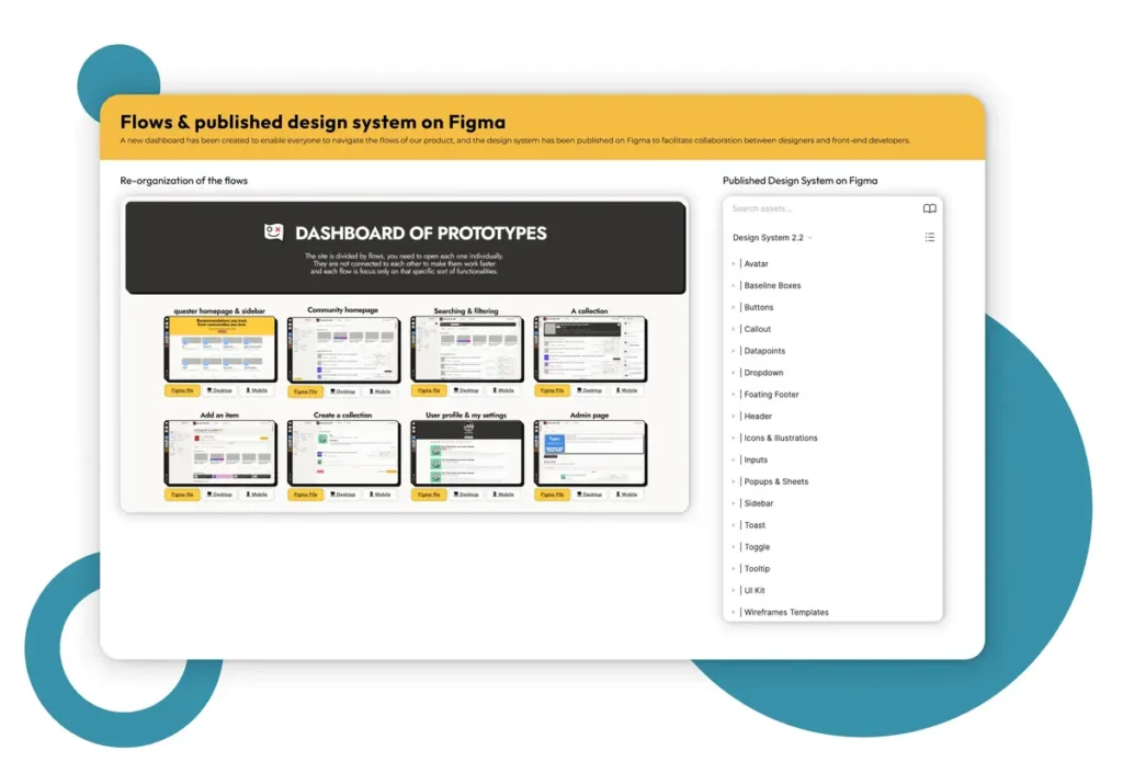
Figma Libraries: Quester Primitives, Breakpoints, and Quester Theme (with automatic Light and Dark Mode).
A new dashboard featuring all the flows and Figma files has been introduced to provide easy access for everyone. Additionally, the Quester design system published in our Figma account.
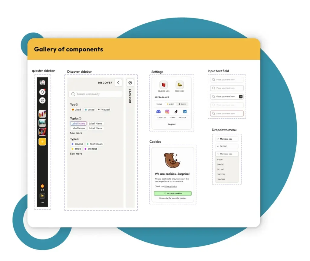
A few examples of the components created to populate the new structure.
What happen next?
After a few sprints with the new Design System, everything changed.
Thanks to how easy was to build new flows with our brand-new design system, we started to re-organise them all. And in only a few sprints we were able to re-design the whole website.
results
Where this project took us?
Ascending to new heights as a company: now everything is brand-aligned.
Establishing a cohesive brand manual, documentation and Figma Libraries led not only to the product team to create a better user experience but got a huge impact in Growth and Marketing teams as suddenly they always know how to deal with brand assets without depend on the product team.
Iterating at twice the speed.
Our design system allowed us to bring knight together to Product and Dev teams and the handoff processes started to run seamlessly. We double the amount of iterations without increasing the team size.
Our metrics have flipped to the positive side.
Our users felt the change since the deploying day. Our engaging metrics and time-to-value started to shown a great behaviour and our users started to send us messages just to say ‘thank you’
But wait, there's more!
This project led us to the next big project in the company.
While we were working on this, we also incorporated the North Star Metric framework into the company, implemented a Growth Levers system, and conducted JTBD (Jobs To Be Done) interviews with users to deeply understand where our value lay and how we could find better ways to deliver it to our users while expanding and growing organically.
It became apparent that we needed to improve the structure of our website to be able to grow organically, transitioning from ‘Communities’ to ‘Spaces’ and transforming the company into a tool for Social Databasing.
That’s how Quester transformed into a Social Databasing platform. Do you know who led the redesign of the entire website?
Surprise, surprise, it was me!
To read more about it click in the following project card.
quester 2.0
Pivoting the business model and changing the site’s structure.


