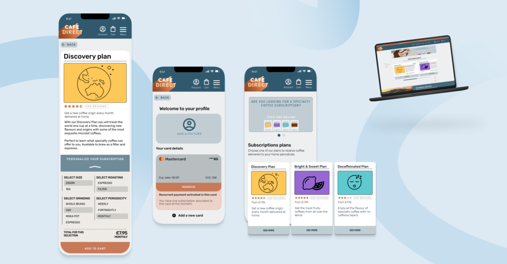
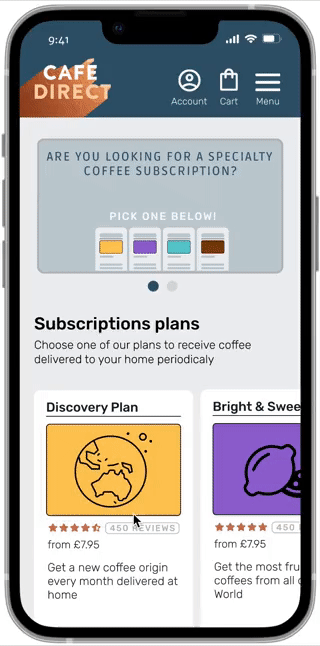
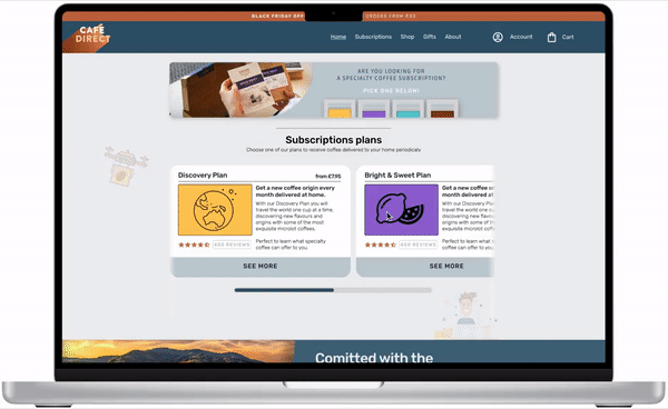
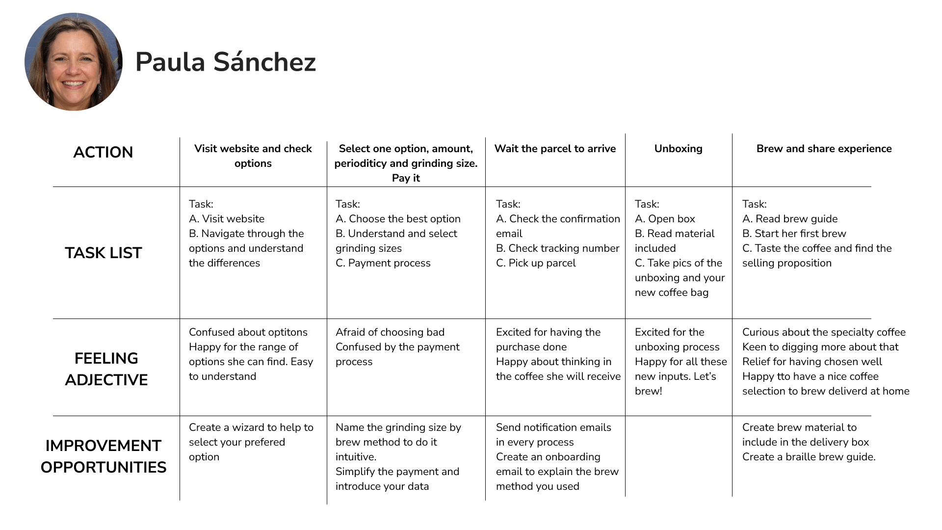
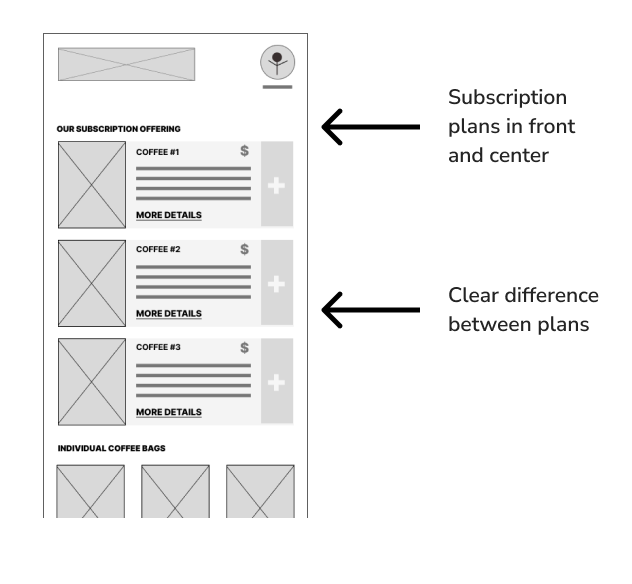
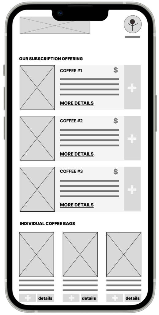
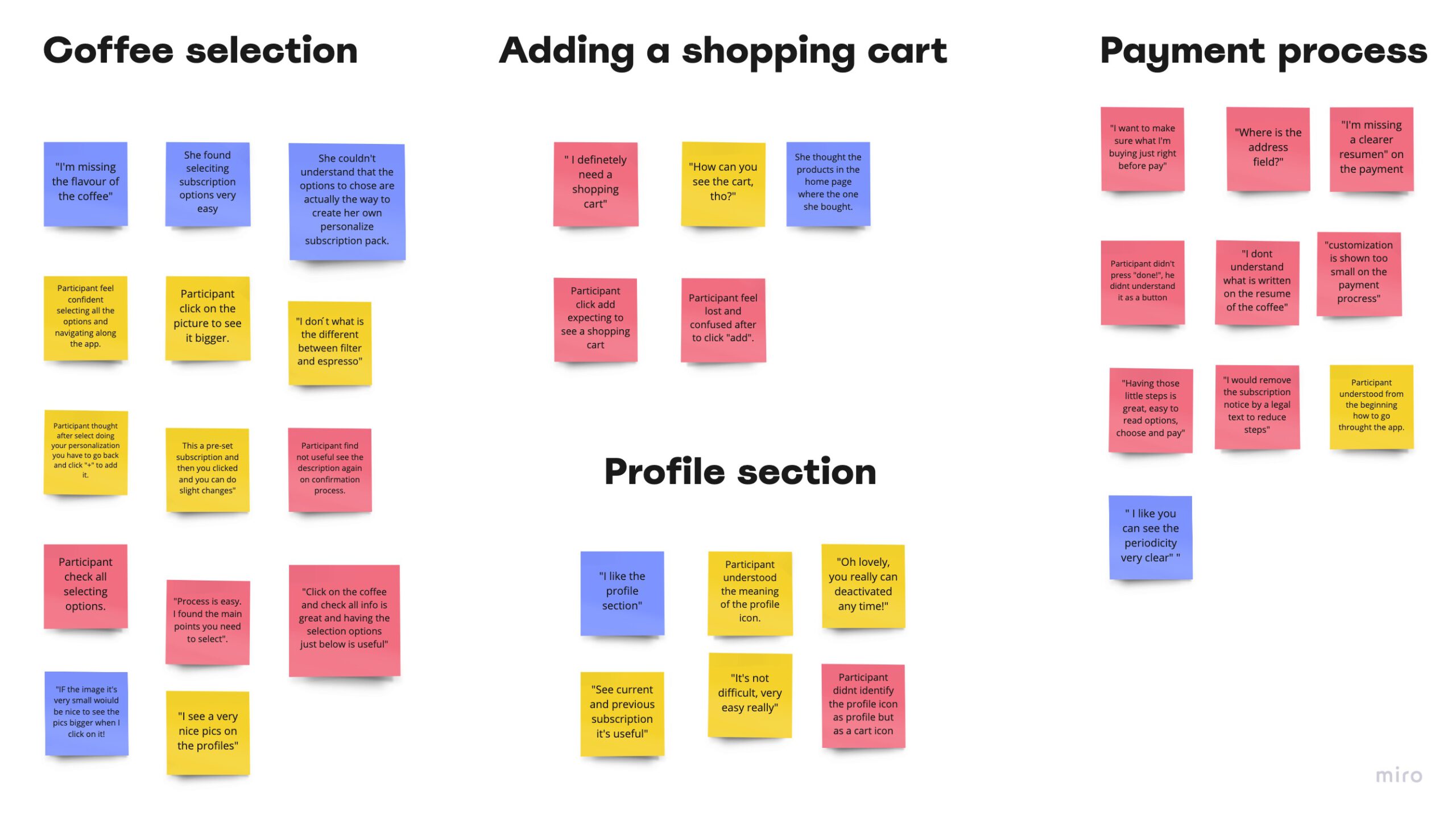
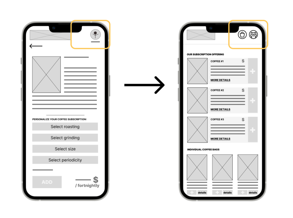
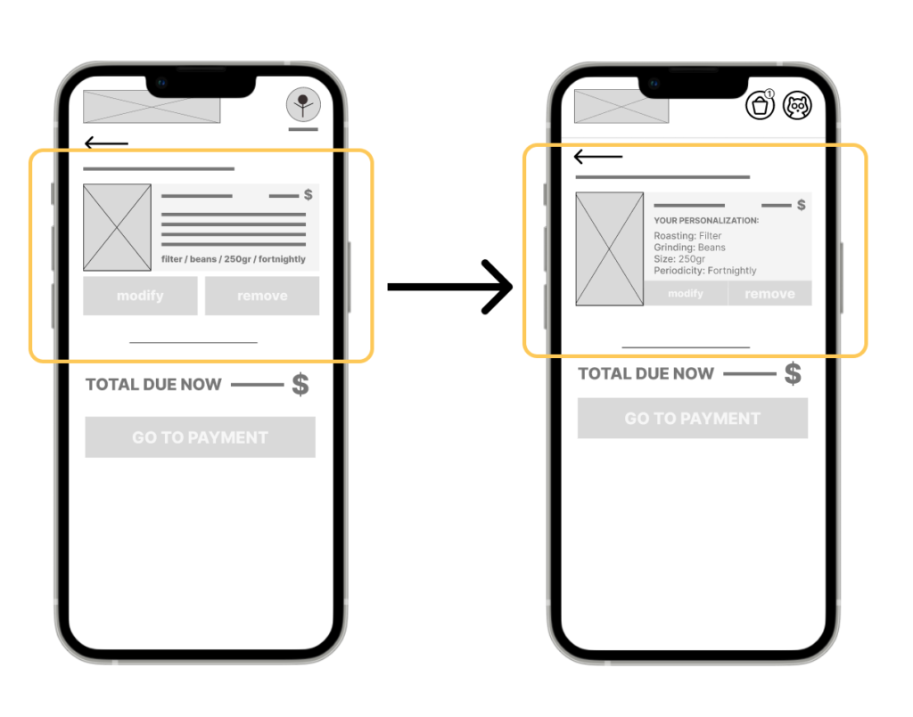
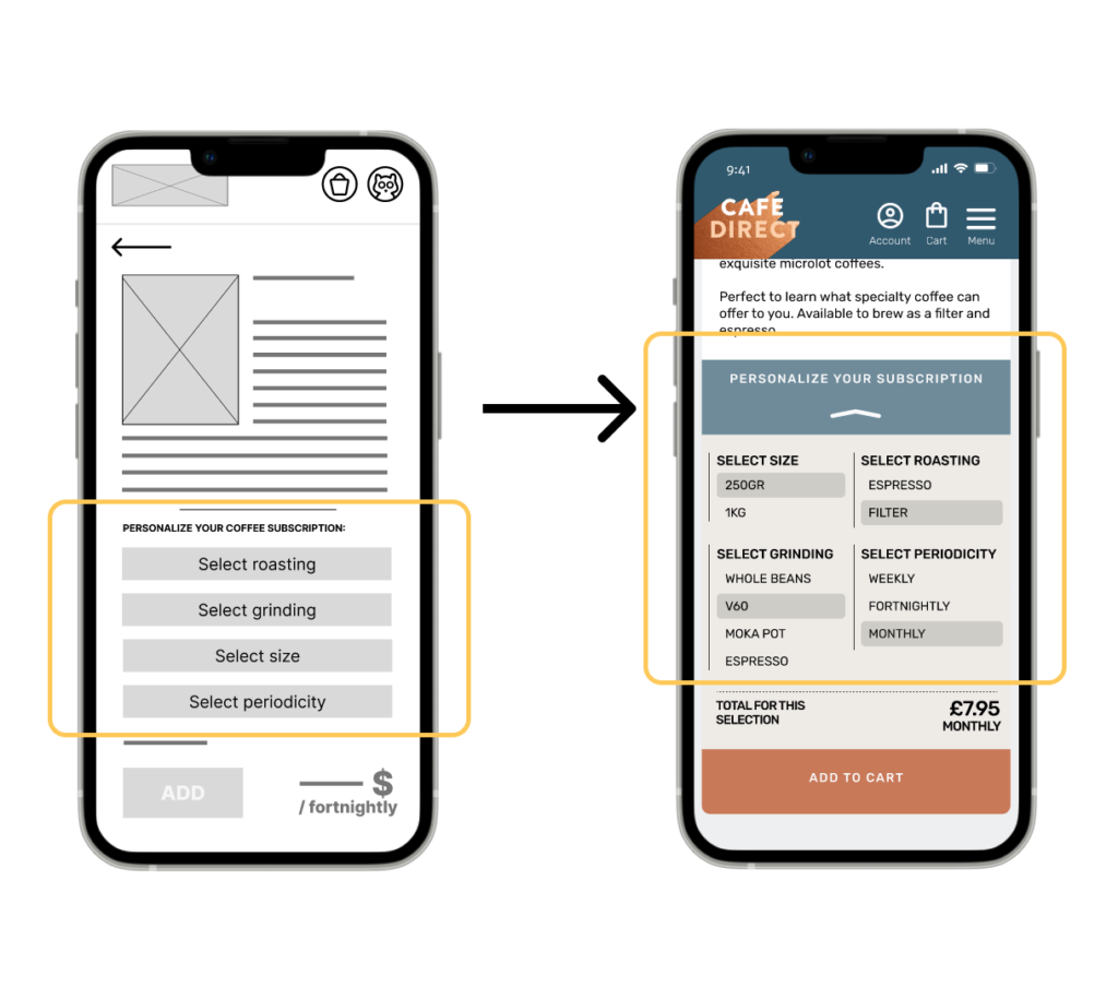
– Can the customer subscribe to a coffee on the terms they want?
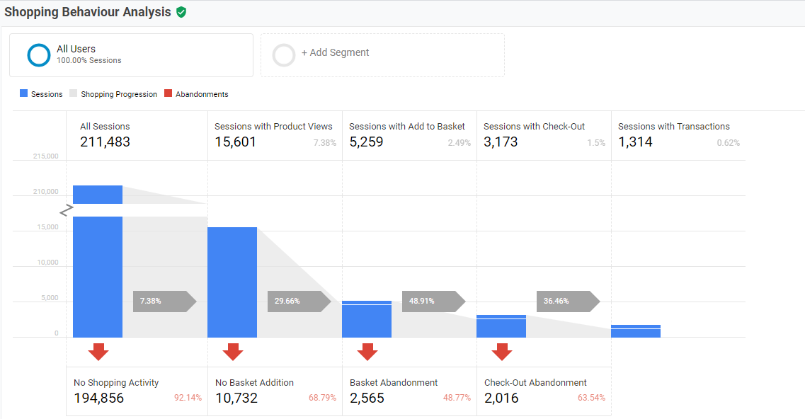
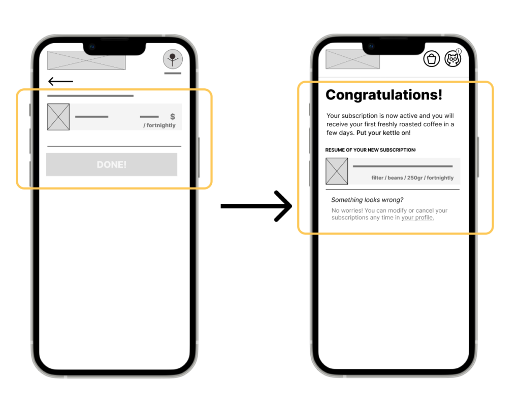
– Is there any part of the process where the customer gets stuck?
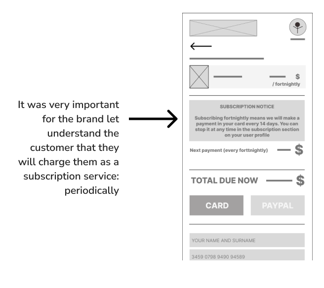
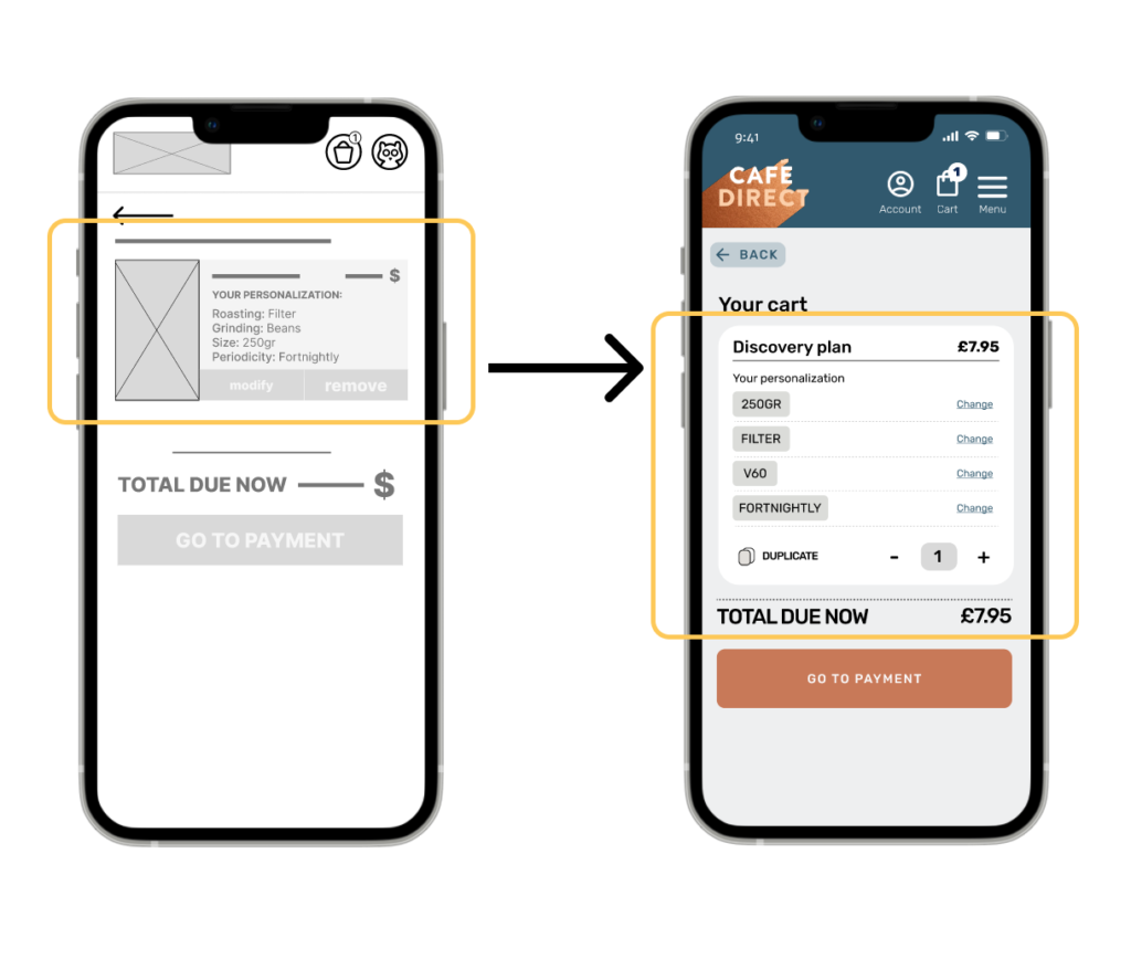
– Is the customer aware they will make a recurring payment for the service?
– Are we missing some features for this app?
Unmoderated usability study
Location: London
Date: 4th Sept 2022
Length: 20 min.
Compensation: 1 year of free subscription.
User will be asked to use a low-fi prototype to complete some tasks
5 participants
2 males, 3 women. From 18 to 65 years old.